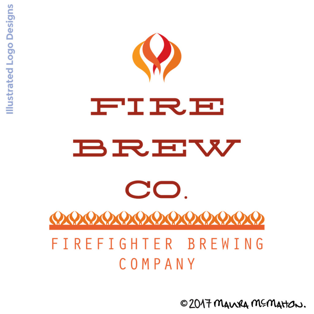
New logo design for a local startup microbrew business!
Working with groups of people and trying to get everyone on the same page with design can be really tricky. I approach design from a creative & artistic perspective – which means everything is open to interpretation. Everyone will have a different viewpoint, and the same design can illicit completely different reactions – which it did in this case.
The initial design was exactly what the client wanted. We discussed it at length and he provided sample photos of badge images we used as inspiration. The first round of logo designs turned out pretty great:
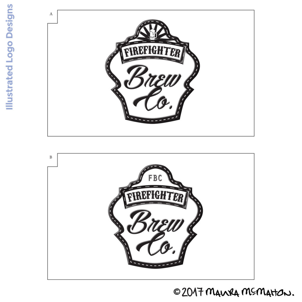
Except the client was the point person for the GROUP. And the group had other ideas. They insisted on a different design direction. So we switched design directions, I integrated feedback from the group and presented 3 different design variations:
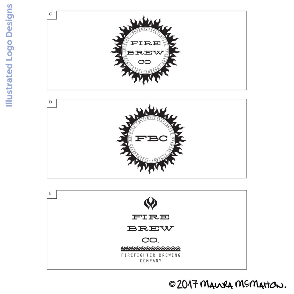
Many times people just need to ‘see it’. The clients really wanted the flaming sun image with the horizontal text in the middle, so I provided it (Even though I didn’t think it was the best design direction). But I also provided a sleeker, more contemporary & hand crafted variation that I thought would work well for their vision. Once they were able to see the possibilities, they were on board with the design.
I’m really excited for them to launch their new business in hand crafted microbrews, sounds like they have a fabulous IPA, which is my favorite!
If you or someone you know & like is interested in collaborating on a logo design for your business, I hope you’ll reach out!